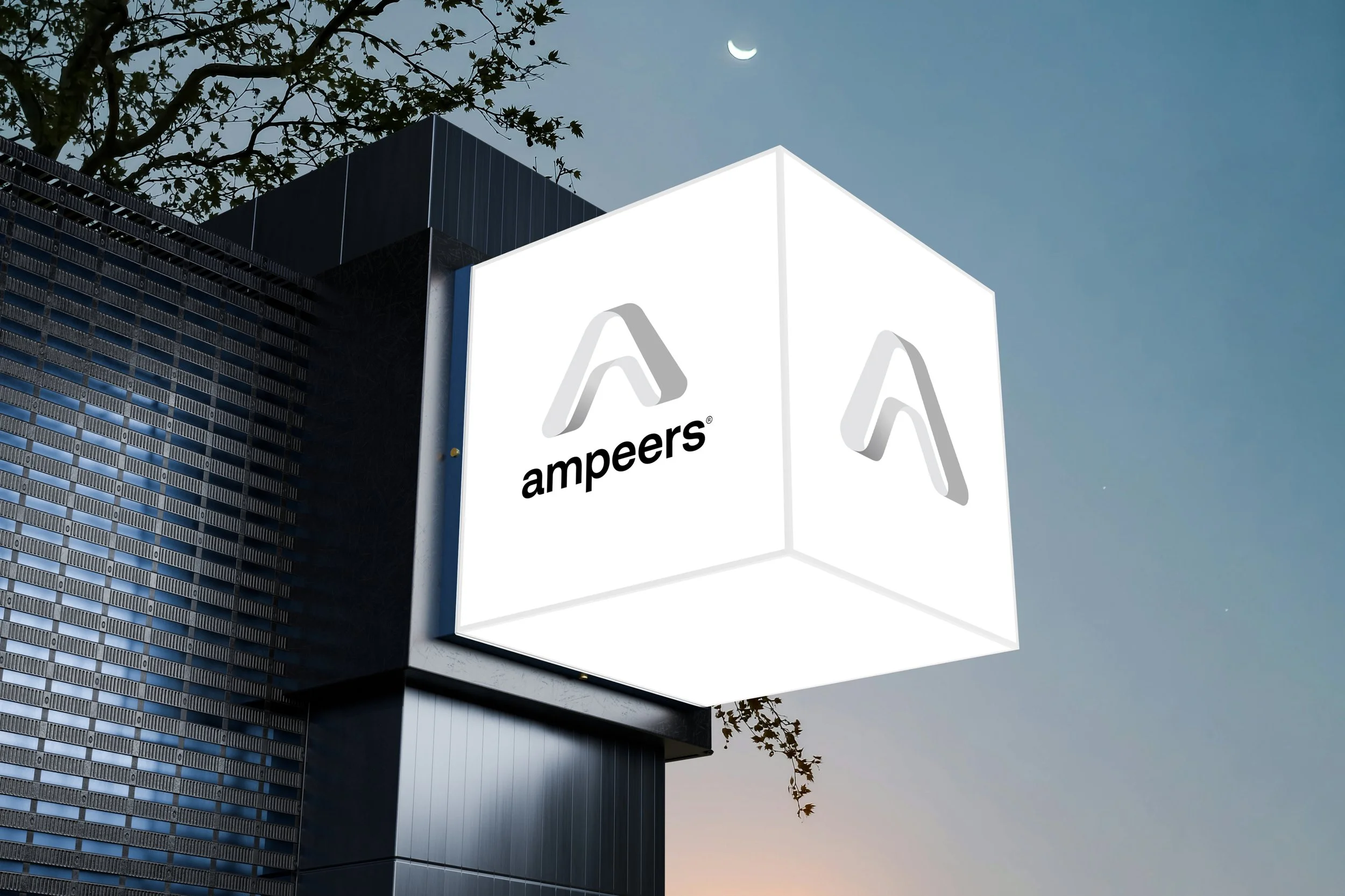
Ampeers
The world's most advanced high-temperature superconductors.
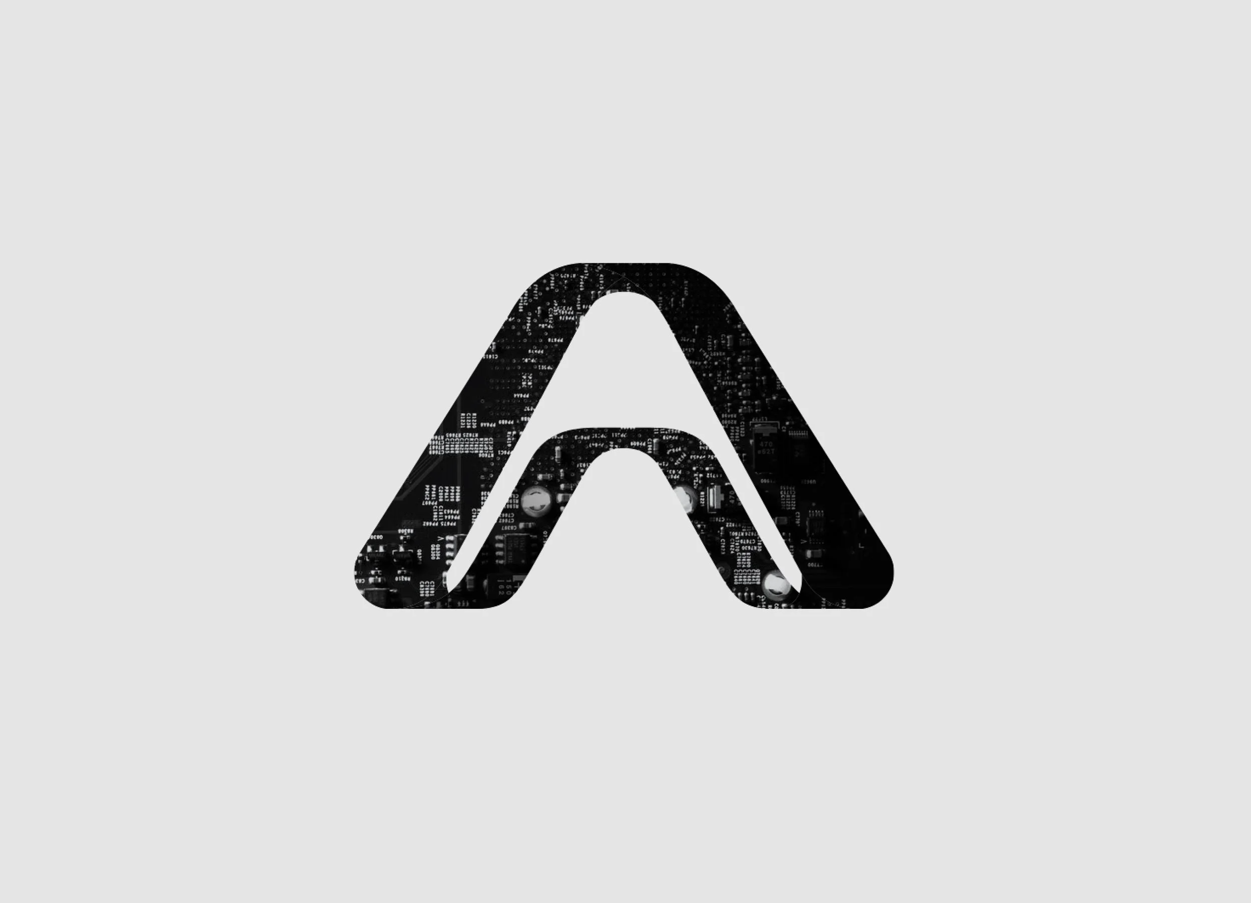
Pathway
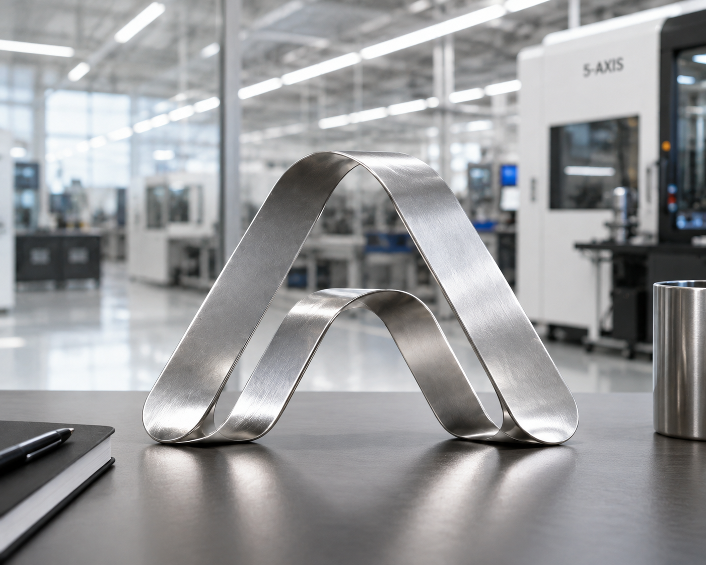
→ A continuous ribbon→ A conductive path
→ Current flowing
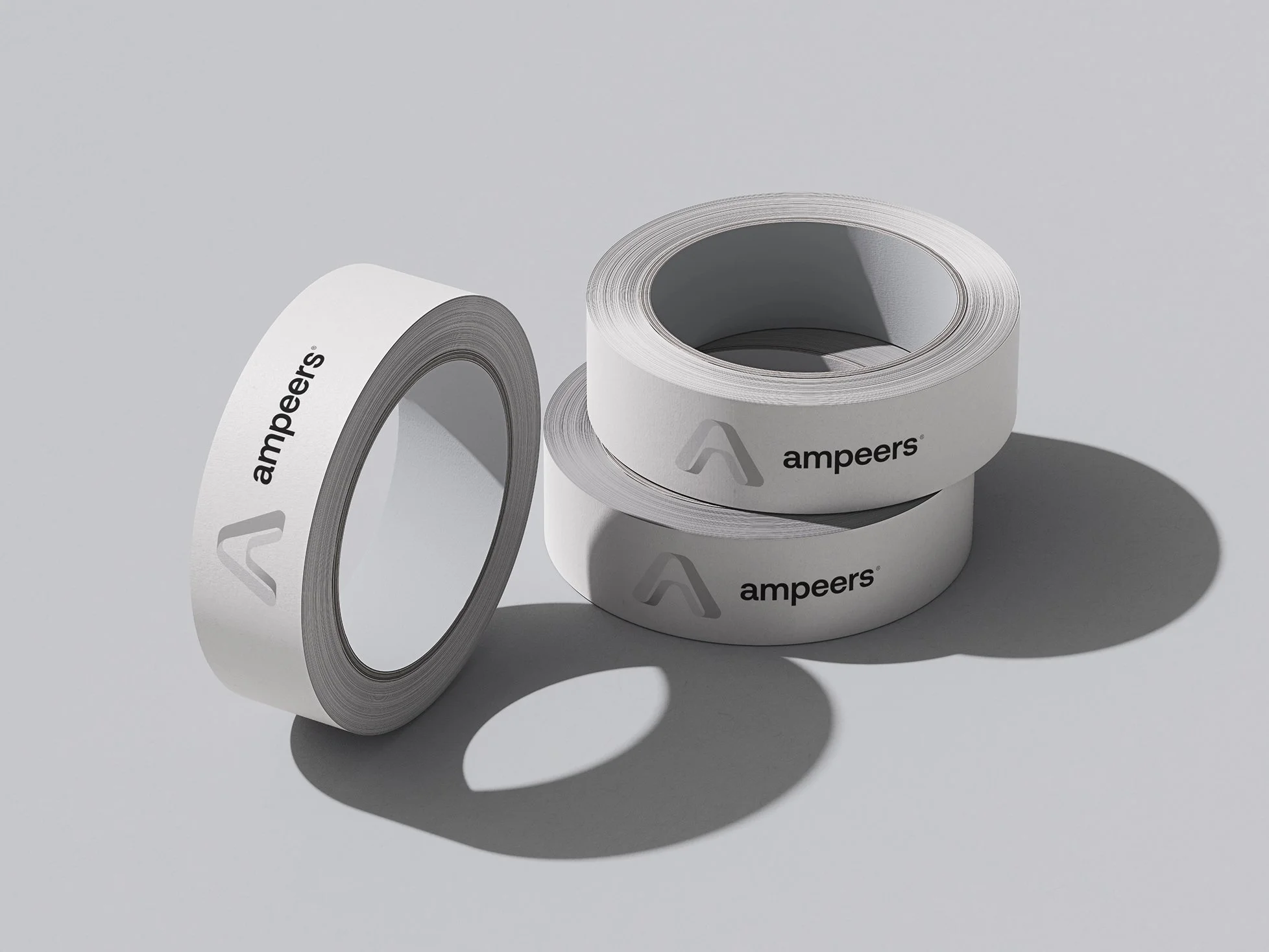
→ 'Engineered' rather than drawn
1. Movement
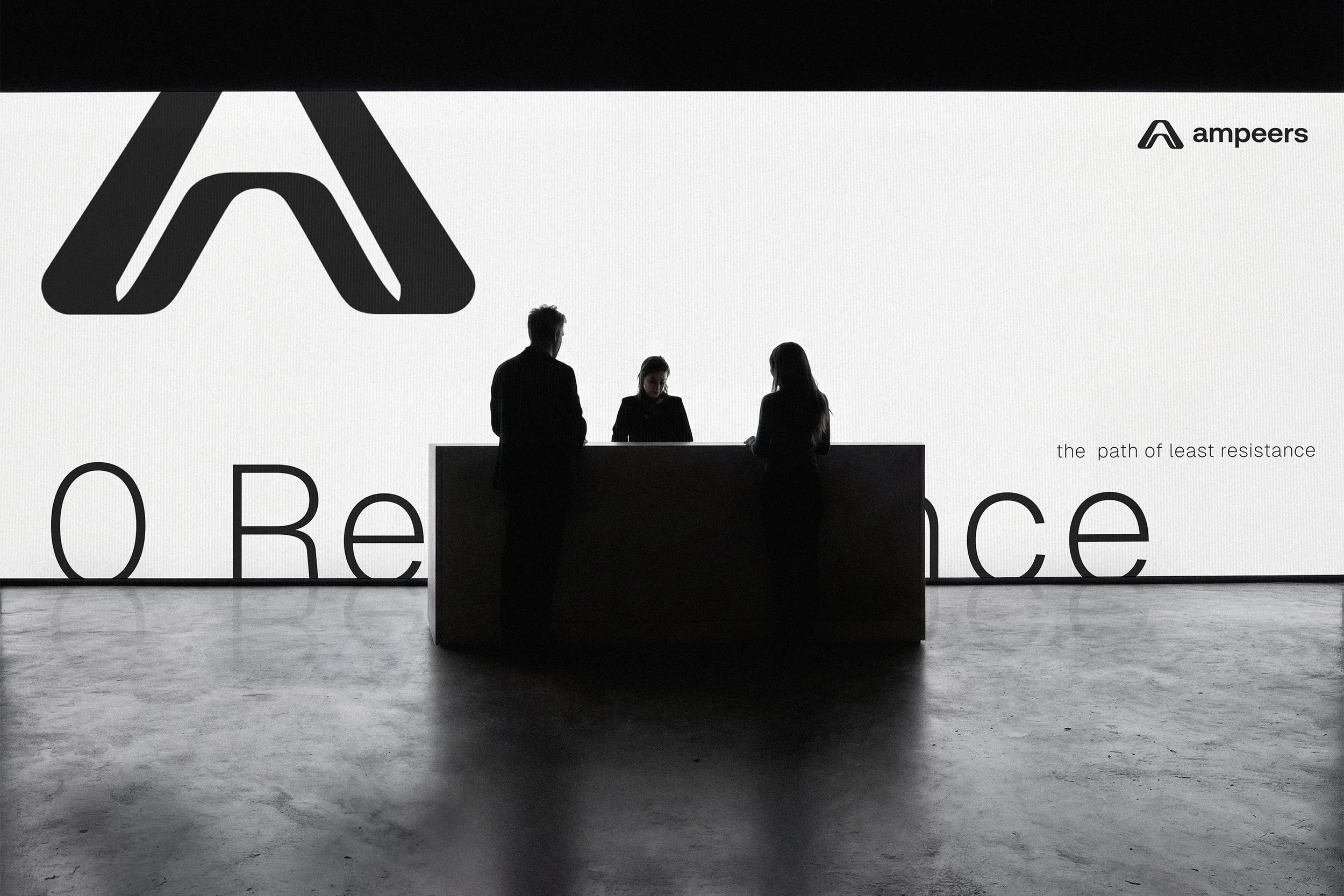
The ribbon doesn’t terminate abruptly. It enters, bends, changes direction, and exits.2. Path Creates Shape
Instead of filling the center, the logo leaves the negative space in the middle. That gives it qualities associated with superconductivity, like low resistance, unobstructed flow, clean pathways, precision, and dynamic applications.3. Feels Engineered
Nothing about it feels decorative... The radii are controlled... The thickness is consistent... The transitions are smooth. It feels manufactured. That gives the impression that the logo could almost be a physical component or machined part.4. Scales Beautifully
The silhouette is extremely memorable. Even at favicon size you recognize: the arch, the ribbon, the opening... there aren’t unnecessary details that disappear.5. Hints at Superconducting Tape
One of the strongest associations is something only industry people may notice. It isn’t literal enough to pigeonhole the brand, but it’s close enough to feel authentic.